A lot of my clients come to me because they want what I call “The Sarah Look,” which generally features a lot of killer photography, bold typography and strong colors. Local Portland lawyer Jeremiah Ross wanted something akin to that, but with a twist.
The examples he showed me that he really liked were from outside his industry, and featured stylish illustrated-style graphics, which is it bit outside my wheelhouse, though the general flow he wanted was definitely my distinctive style. He wanted to make sure he represented the Portland vibe and that the site conveyed a bit of his personality.
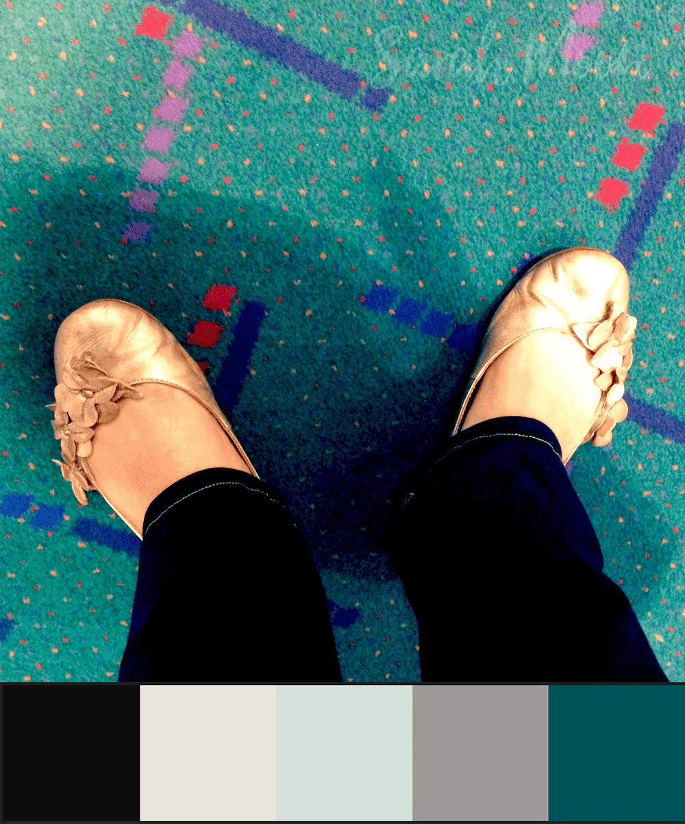
I worked through a few concepts, playing with colors, textures and fonts, and we hit on a design scheme that was actually inspired by the famous #PDXCarpet.
Just for fun, here are the other color schemes we played with:

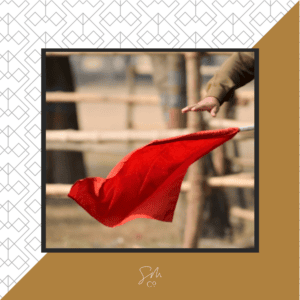
This was my first color scheme idea–you can see that we used the three middle colors in the final color story. I would love to use a similar palette on the right site someday–that red is killer as an accent. It just wasn’t quite the right feel in this case, though.

The first iteration of the #PDXCarpet color scheme idea. I really like these colors are well, but they are BOLD, and ended up being a bit too much for the design concept we settled on.
The Graphic Elements
Typically, I’d enlist the help of my fabulous colleague and friend Ashli Hughes of Cascade Creative PDX on the graphic elements for a project like this, but I had such a clear idea in my head of what the graphic elements should look like that I took on that challenge myself and am pretty thrilled with how they turned out.
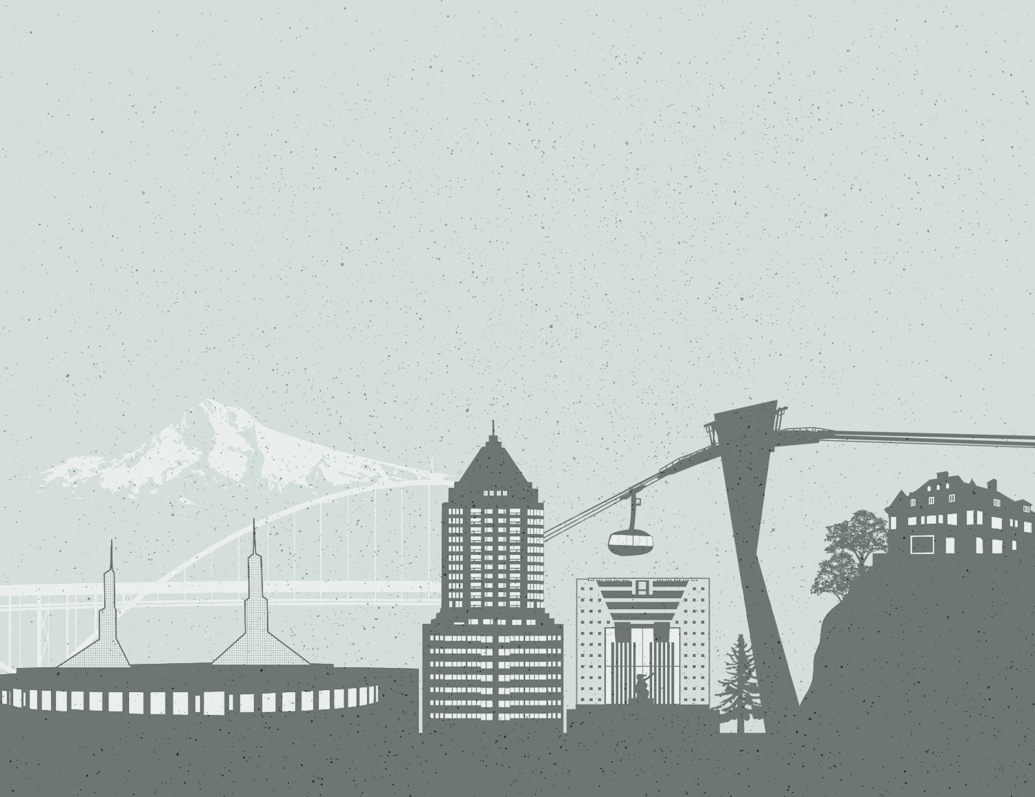
Our Portland Skyline illustration, used as key imagery. I love this slightly distressed style–I’ve been itching to do distressing on a website for ages, but haven’t found a client who’s up for it, until now.

The distressing carried over to our accent imagery, inspired by Portland’s Forest Park, which you can see from downtown and much of the east and north sides of the city.

![]()
![]()
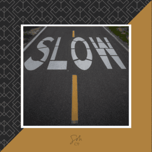
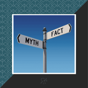
I am really into these cool icons we created to represent each of Jeremiah’s practice areas. They carry over the slight distressing as well. Figuring out what to use for injuries was tough, by the way–a lot of the ideas I came up with seemed awful once I tried them out!
The Final Site
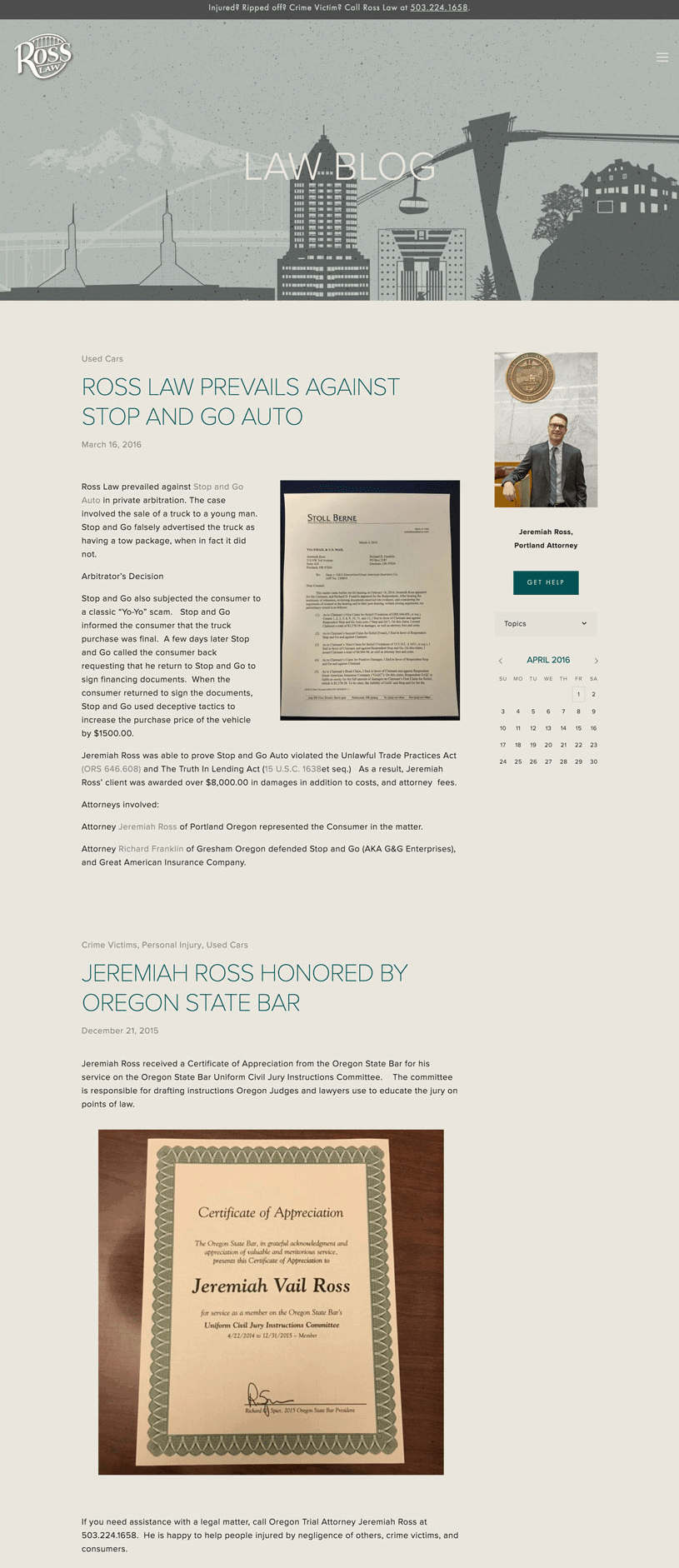
Jeremiah’s blog is an important tool for him and so we paid specific attention to that, and made sure that it had a sidebar and all the necessary elements to make it work well and look sharp.
Here’s a look at the before:
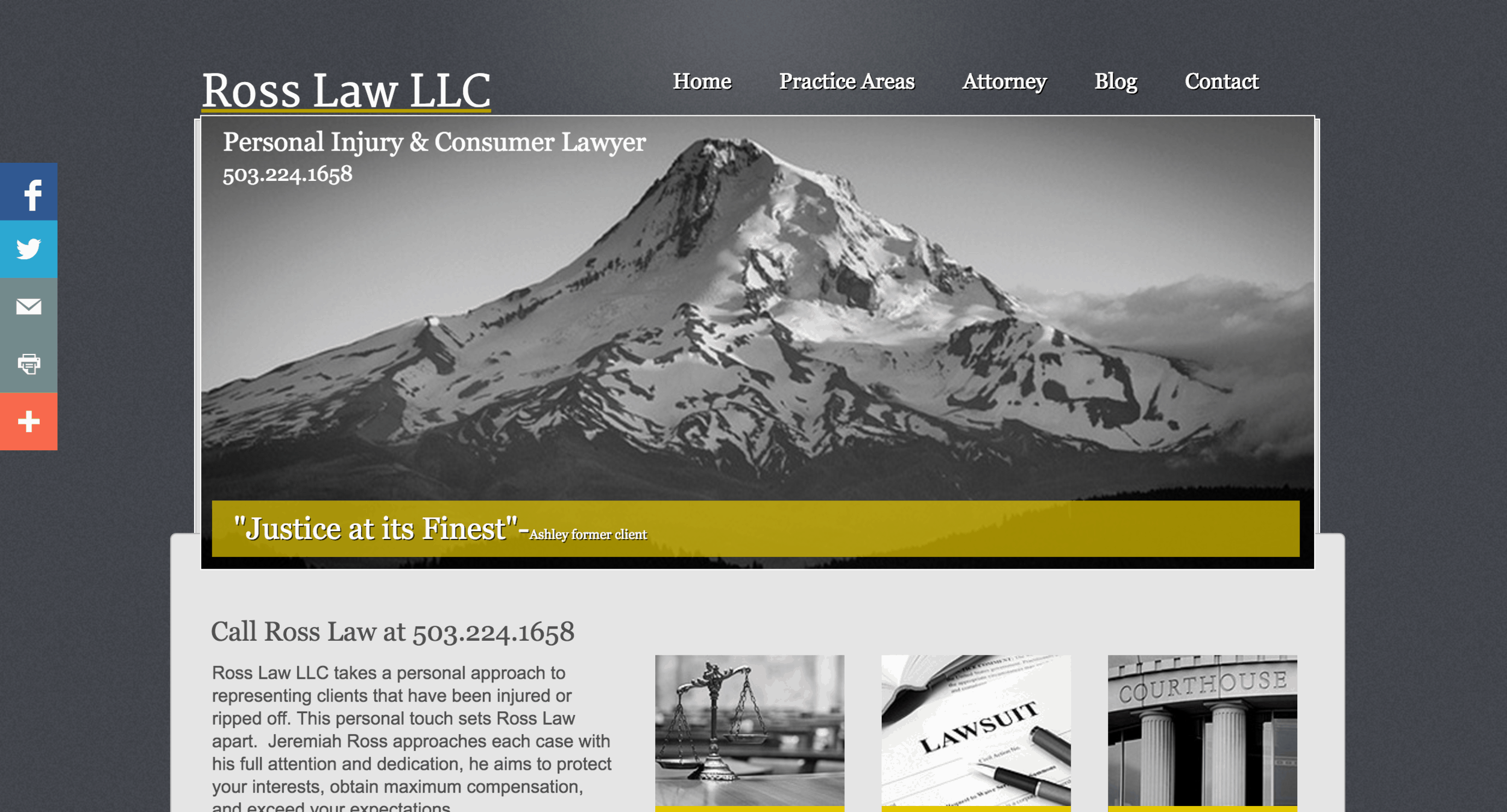 Before: RossLawLLC.com (Yes, we have a new domain name for this one as well!)
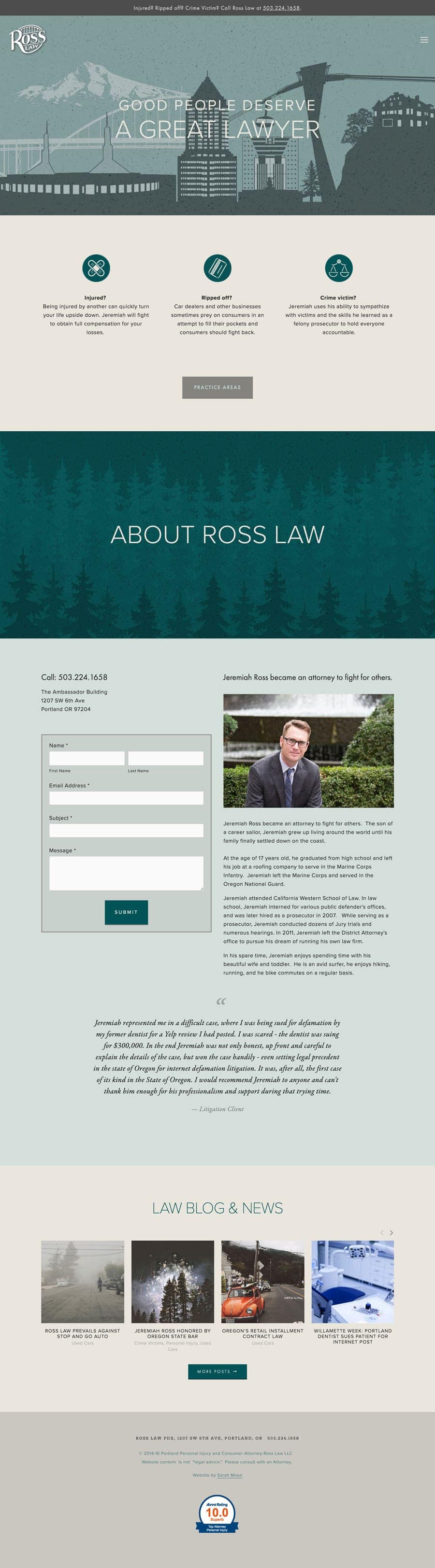
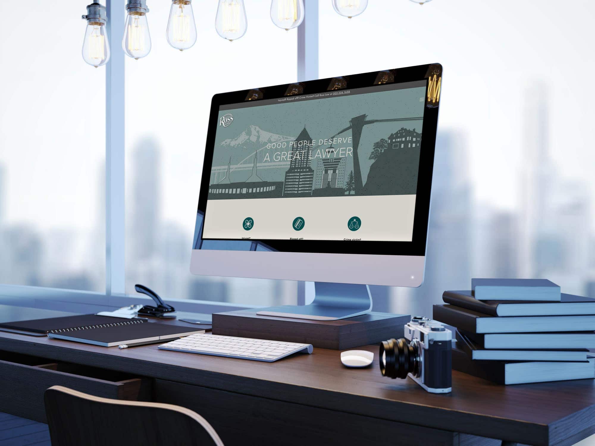 After: The new and improved–and Portland Cool–RossLawPDX.com!
I’d like to give a shout-out to Erica Hettwer from Candidly Erica Photography for the fabulous new headshots for Jeremiah’s website. If you’re in need of a fabulous photographer who will make you feel completely un-goofy (she does delightful family photos as well), get in touch with her. Plus, I’ve literally known Erica since I was born, so she’s good people!


 & Our Favorite Portland Coffee Shops