Remember the post I wrote about the snazzy temporary website we set up for the lovely folks at GreenSavers?
I thought I’d revisit that finished product of that project, which we wrapped up late this spring. This final website was really inspired by that temporary website–more than I’d imagined it would be, actually.
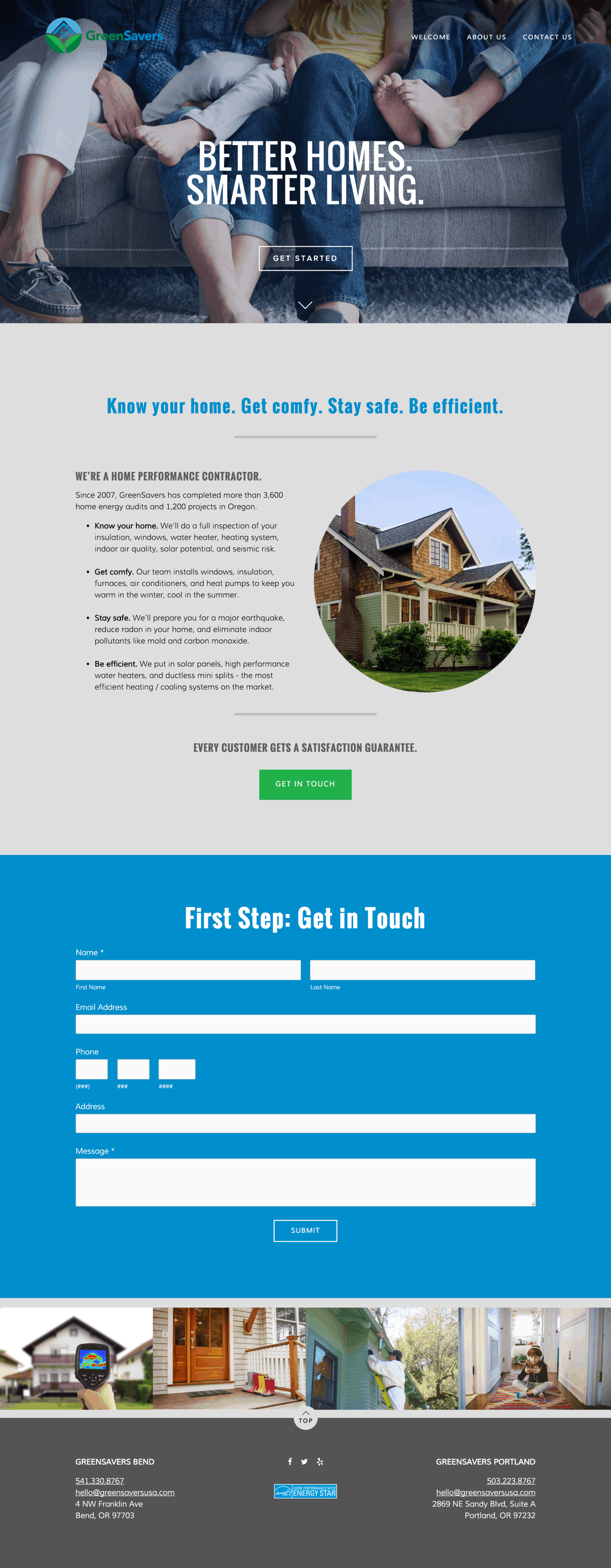
There are a few really cool elements in this site, including the very cool icons my frequent collaborator, Ashli Hughes of Cascade Creative PDX, designed for this project. The folks at GreenSavers wanted to emphasize their four core services: Know Your Home, Get Comfy, Stay Safe & Be Efficient. So, these icons serve to tell that story. We’d actually originally planned for a lighter, more line-art style icon, but Ashli’s bolder interpretation just fit the bill perfectly. I think my favorite one is the efficiency icon that looks like an energy efficiency superhero should be wearing it on a cape.
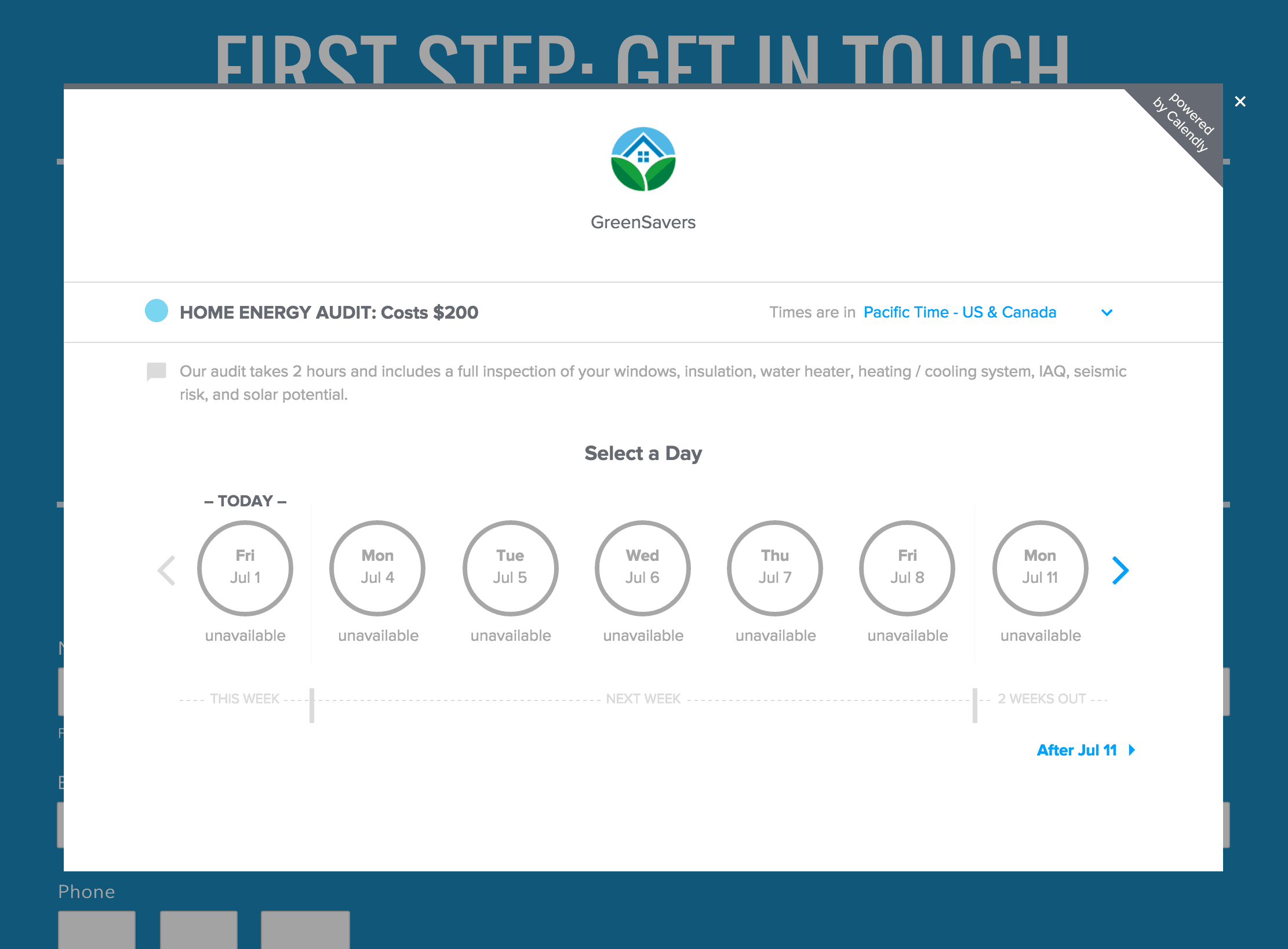
Another key element was actually the brainchild of GreenSavers’ communications manager, whom I’d shown Calendly, which I use for my own prospective clients’ to self-schedule a phone consultation. They integrated this right on their homepage, so folks who need a home energy assessment or a bid on a project can easily select their time and even pay for their assessment online. Cool, right? I love little things like this that make these processes easier for everyone.
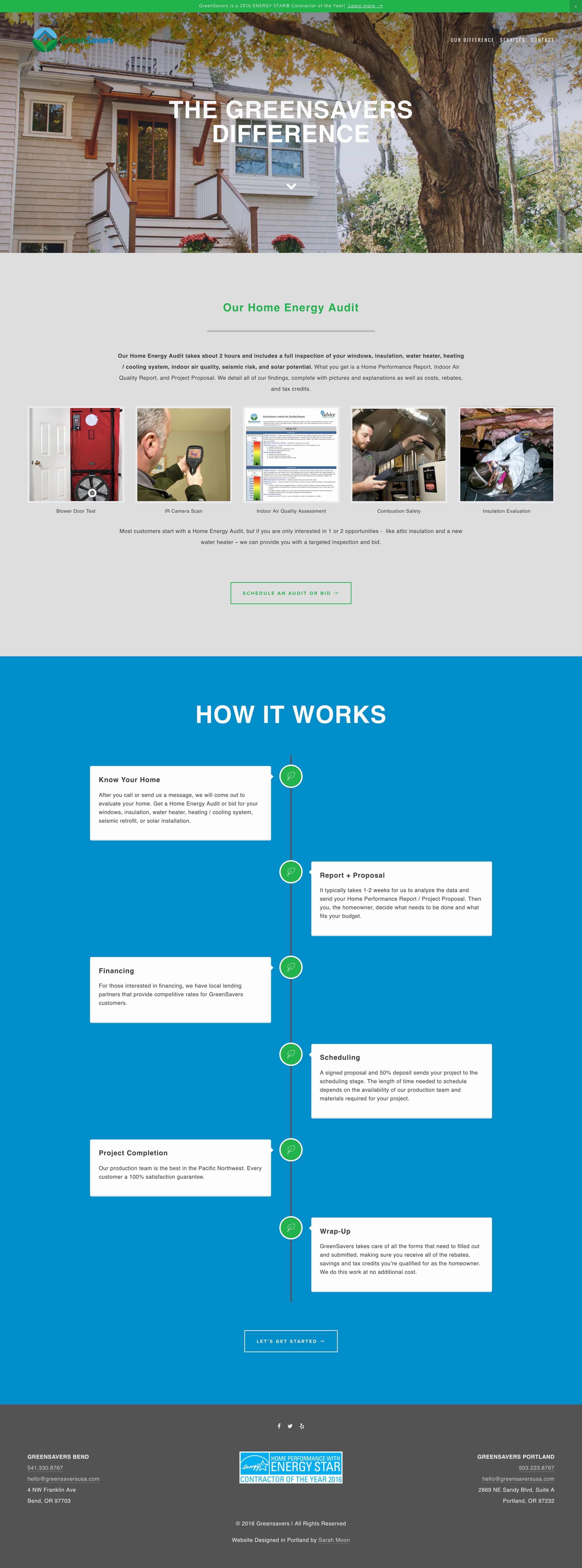
My favorite section of this new site is one that was inspired by my own experience having the GreenSavers team come evaluate my own home’s energy efficiency.
What I discovered was that even I, who’d been working on their website for some time and had gotten to know their business quite well, didn’t fully understand the comprehensive nature of this critical step in their process. (They also do more traditional contracting as well, like HVAC, insulation–I recently had them insulate my 60+ year old house, solar and more.) To me, this was the GreenSavers difference.
So, I proposed that we tell that part of their story a bit more clearly and created the GreenSavers Difference page, which includes a dynamic timeline that explains how the process of getting to know your home happens.
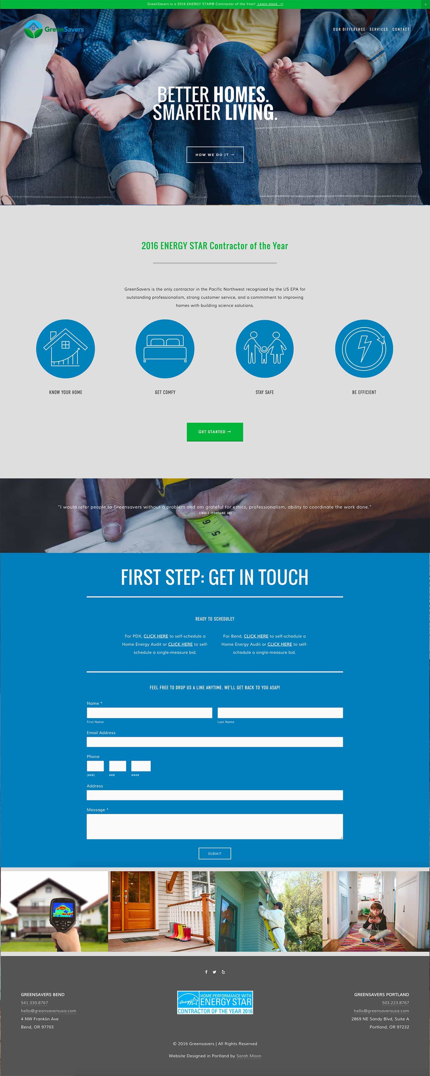
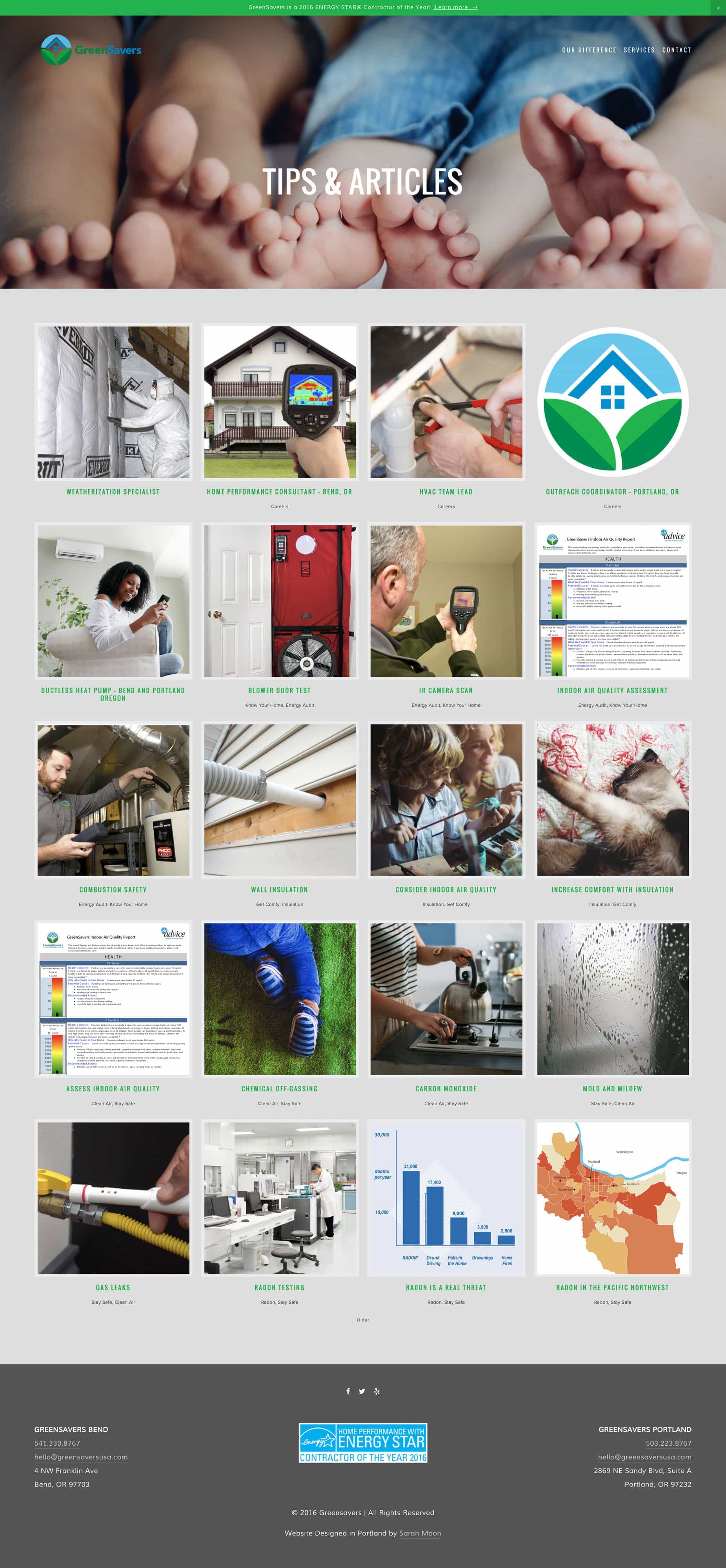
The GreenSavers crew has been hard at work creating blog posts and articles, too, which they’re inserting into the corresponding sections of their website–it provides loads of information and also should, in time, give them a healthy search engine optimization boost. I also love that they’re using it for lots of purposes, including job listings.
The thing I like most about this project is that it will really serve as a tool in GreenSavers’ marketing kit. Like the rebrand they just went through, this is another piece that will represent them well and make it easier for customer to better understand what this unique business does.
Check out the new and improved GreenSavers USA website at greensaversusa.com and, as always, drop me a line if you’re interested in talking about your own project.
Site Credits
Design: Sarah Moon | sarahmoon.net
Icons: Ashli Hughes | cascadecreativepdx.com
Copy: In-house from GreenSavers USA


 & Our Favorite Portland Coffee Shops