Marketing & SEO Strategy Blog
Explore perspectives on marketing and business strategy and how your website, SEO, thought leadership, and streamlined pricing position you to make massive impact, while building your authority on your terms.
Squarespace Hosts White Supremacist Websites
Squarespace needs to stop hosting white supremacist websites--now.
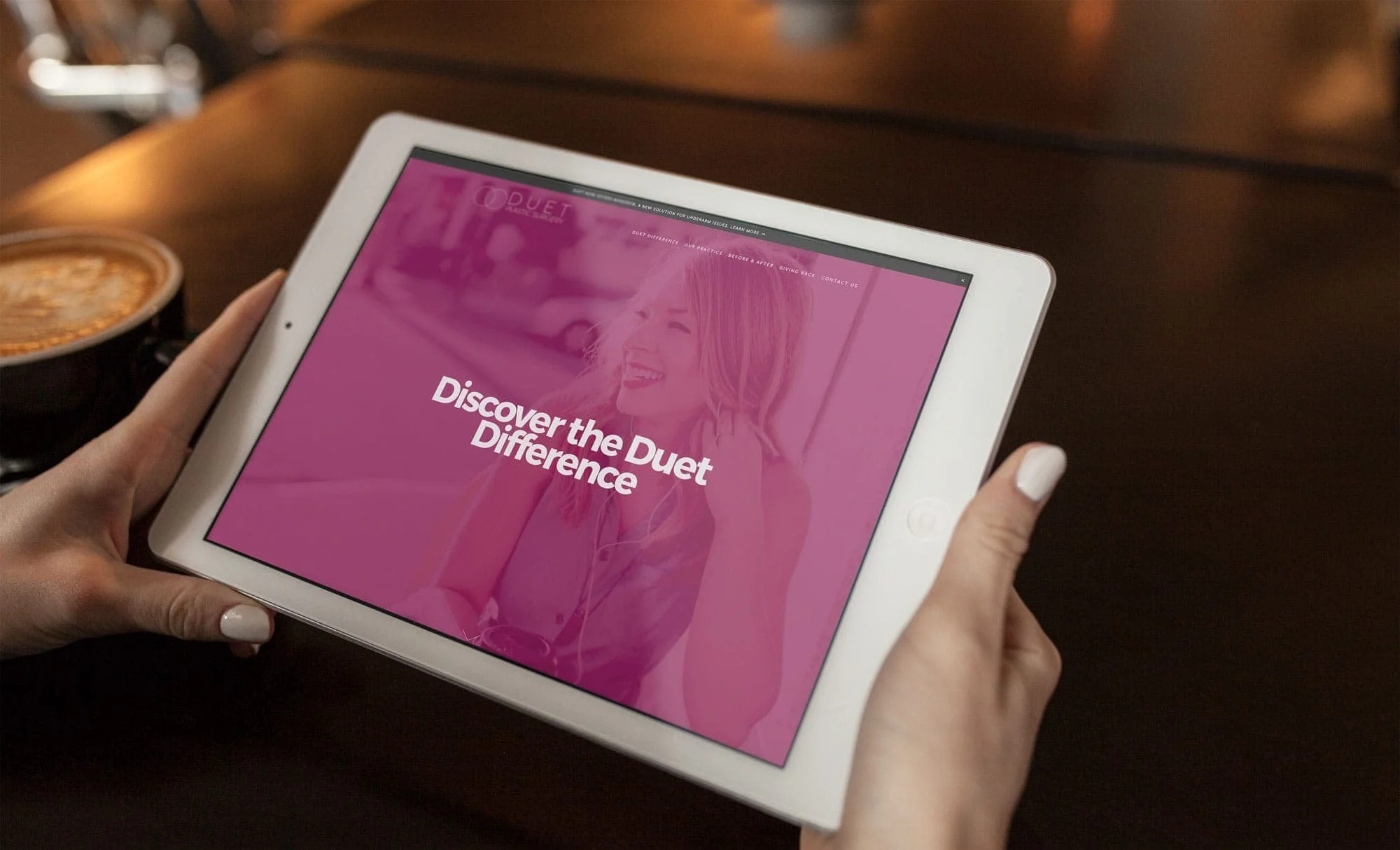
Duet Plastic Surgery Squarespace Website Wins Gold Hermes Creative Award
Awards aren't as awesome as happy clients, but they sure are nice! I'm super thrilled to announce that the website I designed for the awesome doctors of Duet Plastic Surgery (which included a slick brand overhaul) recently won a Gold Hermes Award from the Association of Marketing and Communications Professionals. Cool, right?
What Squarespace Users (Bloggers Especially!) Should Know About Internal Site Search
Curious about what happens when someone searches inside your Squarespace site? Let's take a look at the limits & best practices for blogs, shops & more.
Squarespace Website Design & Branding for Duet Plastic Surgery
Introducing Duet Plastic Surgery's new website built on Squarespace's Developer platform. This is a vibrant website for a medical practice based in Palo Alta, California that also included branding and copywriting.
Planning Your Portfolio Website: 3 Fool-Proof Website Outlines to Use Right Now
When Kath and I first started thinking about launching Design in a Day, I looked back at my notes from the portfolio website class I taught at PNCA for many years. I had a handful of "cheat sheets" to help students who were stuck figuring out their site's structure.
Digging these back out, I found three that my students referred to over and over again.
#1 Just the Work, Please
I love this all-business approach to websites for creative folks. With this outline, we put the work at the center of the site, using it as the key visual on the homepage. Here's what this site outline, sweet and simple, looks like:
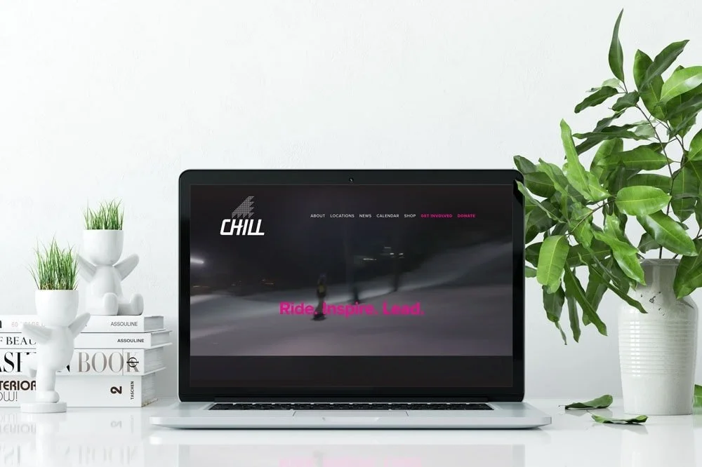
A New, Dramatic Look for Burton Snowboard's Chill Foundation
The Chill Foundation, the non-profit foundation started by Burton Snowboards' founders Jake and Donna Carpenter, is an amazing organization. They have locations all over the country and engage at-risk youth in leadership activities through boardsports, including snowboarding, skateboarding, stand-up paddle-boarding and surfing.
Ages ago, I worked for the City of Portland, and one of my projects was public relations and promotion of the city's skatepark project (which Portland has, sadly, let go by the wayside). This was one of the most gratifying projects I worked on during my time in the public sector, so it was awesome getting back to a subject I'd been passionate about so long ago. (Fun fact: my last day on the job at the City, then Mayor Tom Potter invited me to join him in cutting the ribbon for a new skatepark and I may have cried a little at that generosity.)
Chill had a nice Wordpress based website but it didn't have the storytelling vibe that they needed. It wasn't edgy or boundary-pushing. It worked, it looked nice, but it didn't match their work. My team and I were excited to re-envision what Chill.org could be, complete with a fab hero video (created by Vitae Sessions), vibrant colors, some edgy-feeling iconography, an interactive map and an awesome infographic created by my frequent graphic design collaborator, Ashli Hughes of Cascade Creative PDX.
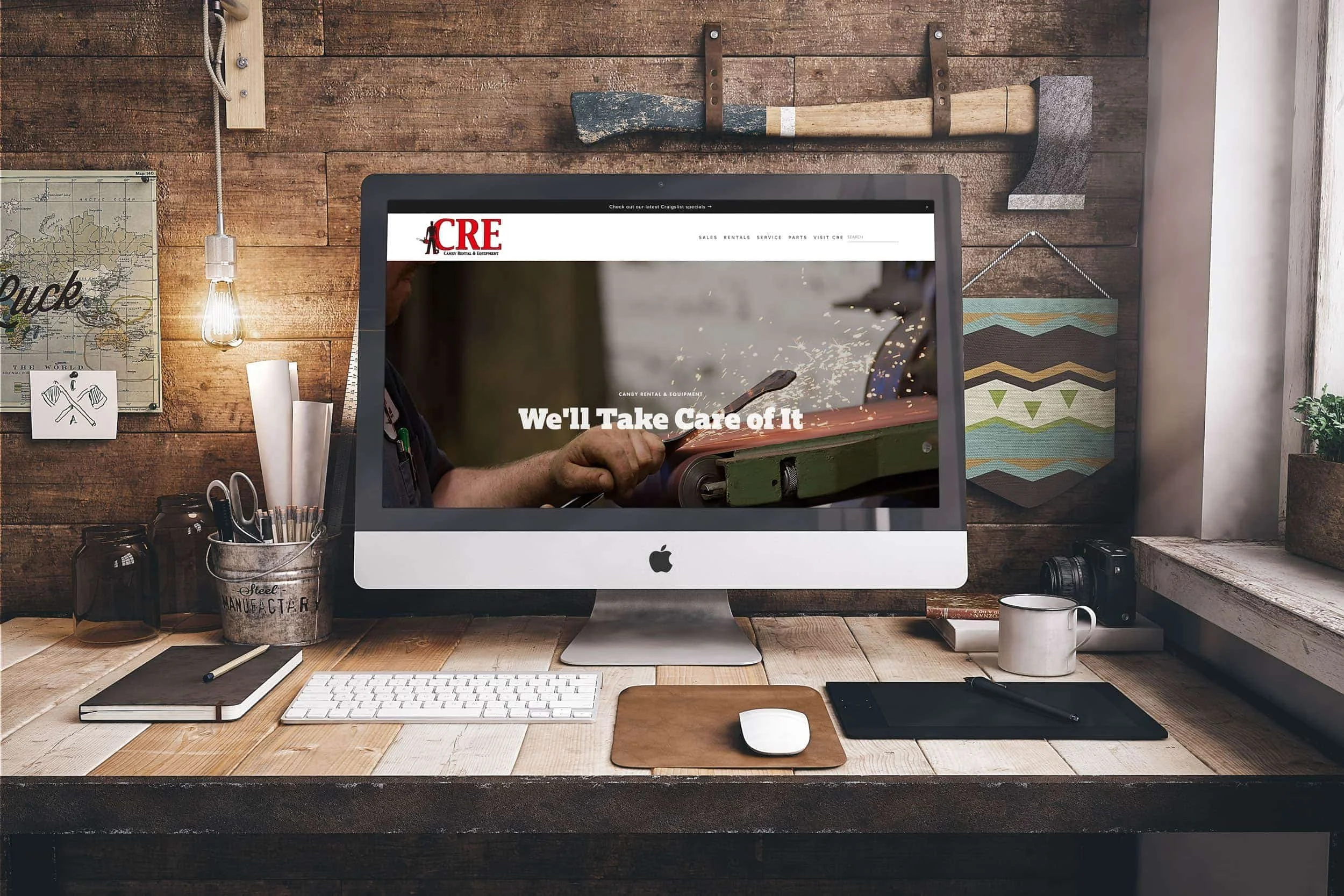
Canby Rental & Equipment Wins a Gold Marcom Award
Canby Rental & Equipment won a Marcom award for custom small business Squarespace website design.
8 Tips & Tools for a Better Squarespace Blog
Want to start a blog using Squarespace? Here are some tools to make your Squarespace blog better!
A Total Makeover for Canby Rental & Equipment!
I couldn't be more excited to launch a new online presence for my client Canby Rental & Equipment. CRE is a three-generation family owned business in my small hometown on Canby, Oregon. It's a business focused on sales, rentals and service of small equipment--everything from Stihl chainsaws to tractors to weed whackers. I've know the now-owner, Matt, for many years, thanks to high school English class and it was a blast taking their website in a brand new direction that you're unlikely to see from another small equipment company.
Their previous site was functional, but didn't represent their growing business and wasn't mobile friendly (a common story). Also, because the business had grown, it didn't represent the breadth of sales/services/rentals the company offered, nor did it allow them to grow the site as needed (also a common issue). Using a simple content management system like Squarespace was a big step forward for CRE, and I'm excited to see where Matt takes his website and business in the coming years!
5 Questions to Consider When Talking to a Squarespace Designer
Every wonder how to hire a Squarespace website designer? Here are the questions to ask!
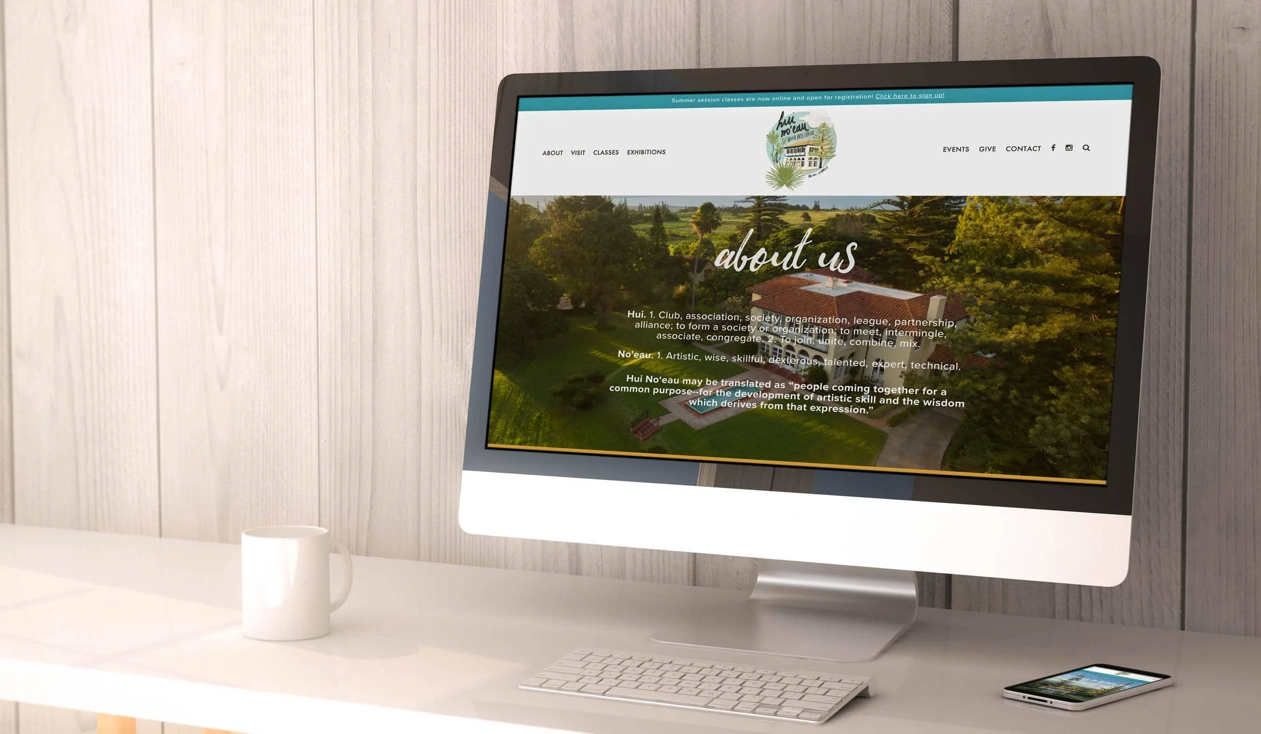
Reenvisioning the Squarespace Website for Maui's Hui No‘eau Visual Arts Center
Squarespace Website for Maui's Hui No‘eau Visual Arts Center, a non-profit site with a class catalog, custom fonts and parallax scrolling.
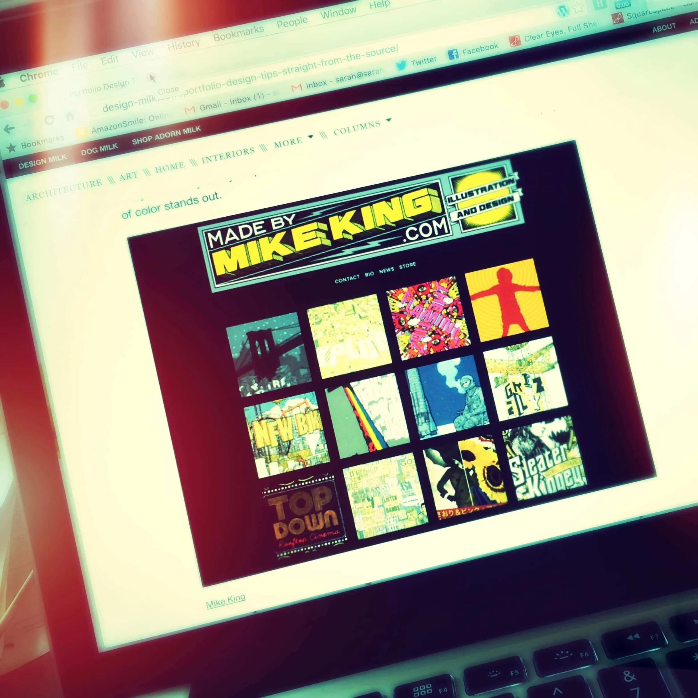
Made by Mike King Featured on Design Milk
Squarespace portfolio design featured on Design Milk.

Get More Marketing Insights in Your Inbox
Tips, inspiration, commentary, and the latest articles right in your inbox. Always spam-free, always 100% human. Sign up for my newsletter and join the fun!


