Planning Your Portfolio Website: 3 Fool-Proof Website Outlines to Use Right Now
Update 2021: Grab free access to our portfolio planning workshop.
When we first started thinking about launching a productized website design service, I looked back at my notes from the portfolio website class I taught at PNCA for many years. I had a handful of "cheat sheets" to help students who were stuck figuring out their site's structure.
Digging these back out, I found three that my students referred to over and over again.
#1 Just the Work, Please
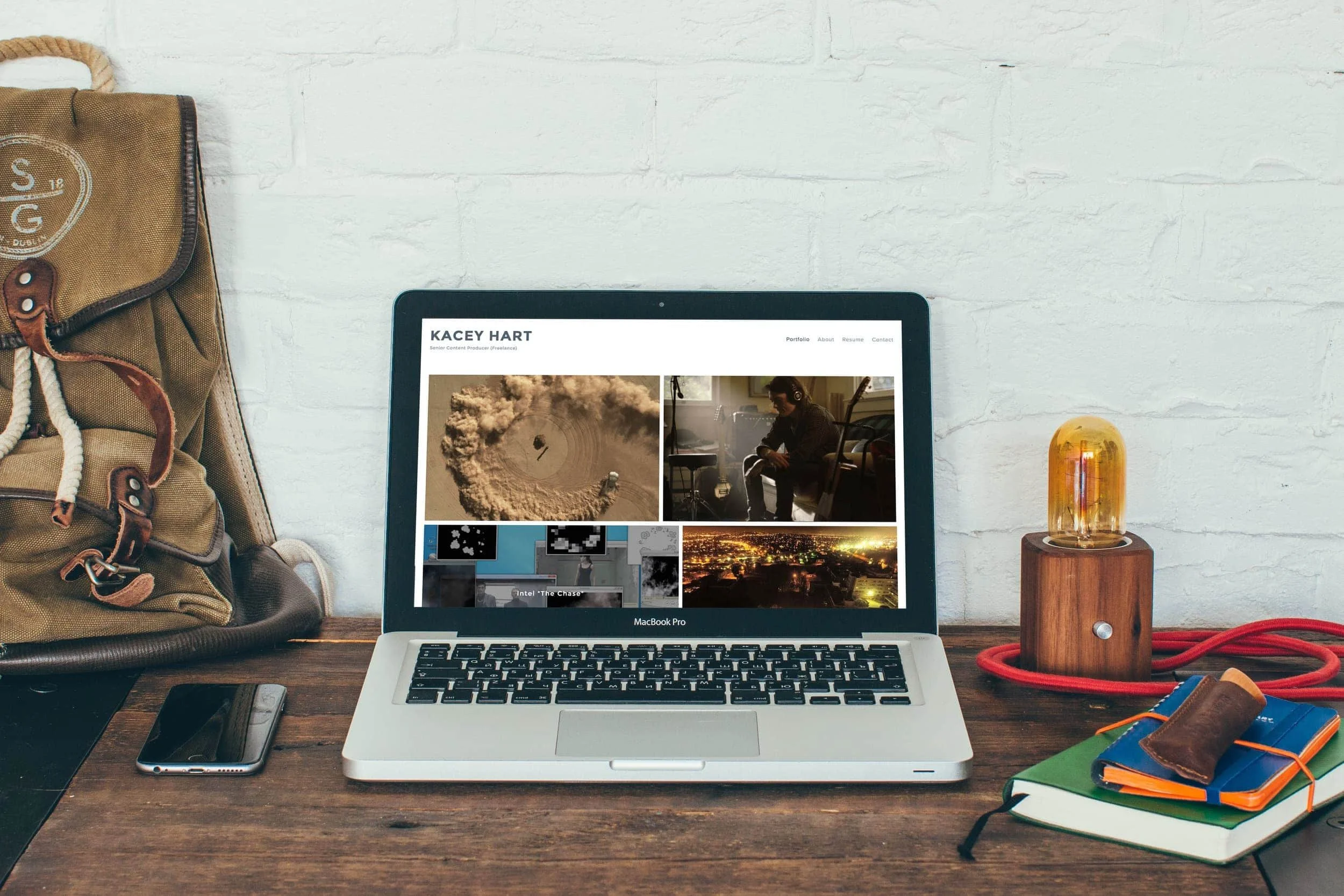
I love this all-business approach to websites for creative folks. With this outline, we put the work at the center of the site, using it as the key visual on the homepage. Here's what this site outline, sweet and simple, looks like:
Gallery of "Greatest Hits" Work -- I like grids for this, but a slideshow would look great as well. (Homepage)
Bio - Let folks know who you are. If it's normal in your field, this can include your formal artist statement as well.
Blog - One thing I tell all of my artist clients is that documenting their process can go such a very long way toward communicating point of view. On a site with this structure, this is even more critical. Start a blog, commit to posting "behind the scenes" photos of your work every month and see what happens.
Contact & Commissions - Make sure people can reach you! This is also the time to mention that you're available for commissions.
Tip: Try out Squarespace's Wexley template if you like this structure--it's perfect for a clean, but distinctive, professional portfolio. You'll love the flexibility of the grid gallery in this template.
#2 Make a Splash
This is an approach I like for established creative pros who want to present themselves with confidence and have a substantial body of work under their belts.
Splashy Homepage - Think about a memorable image and a call-out statement that grabs people's attention
Bio/About Page - Touch on your experience and point of view; this is the place to reference publications and other elements that give you authoritative "chops."
Work - If you have a lot to showcase, using Squarespace's blog feature may work better for you, if you don't mind posting chronologically.
Contact/Work Inquiry - Again, make it easy for people who like what you do to connect with you.
(Optional) Services - If the bulk of your work is commissioned, if you're a designer or writer, this is where you should outline what you offer. Keep it simple, if you can--this is a portfolio site, after all.
Tip: It's a slightly unusual choice, but I like templates from Squarespace's Wright family for sites like this. Take a look at Rover and try to visualize how cool this layout would look showcasing your personal style and work.
#3 Tell Your Story
This is probably the hardest structure to pull off because you'll really need to think about your content--that pesky written content. I also like this structure to be tied to a more casual or conversational tone.
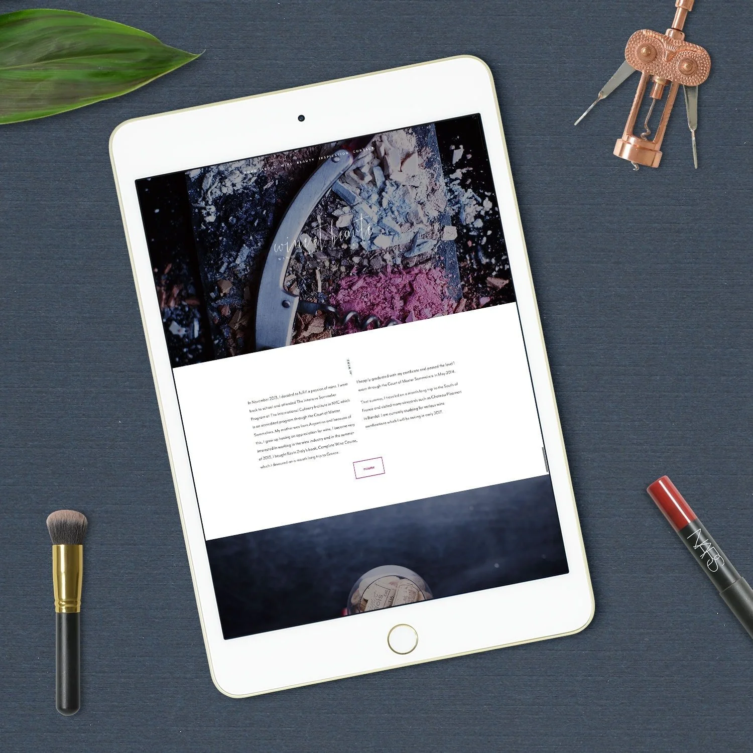
Storytelling Long Scroll (Homepage) - Tell people your story--how are you unique and different? You don't need an about page in this site structure.
My Work - Showcase your best work here--don't through the entire kitchen sink at it, instead curate your favorites.
Work with Me - Outline your services--consider creating some stylish icons (like I have on my homepage) to represent these services.
Blog - With this style of portfolio site, I think a blog is mandatory--it's all about your voice and point-of-view.
Get in Touch - Create a friendly contact page that invites work inquiries.
Tip: You can use several different templates to achieve this, including Mojave, Jasper and Hayden.
As you can see, each of these are very simple website structures--you don't need anything complicated to create an effective, stylish portfolio website.


