Three Lessons Nonprofits Can Learn from Successful Entrepreneur Websites
We work with a lot of nonprofit organizations on their websites, identifying tech solutions, and refining their marketing strategies. One of the things many of our nonprofit clients are surprised by is how we borrow techniques and strategies from entrepreneurs and rework them for the not-for-profit realm. Ultimately, the website and online marketing goals of businesses and nonprofits aren’t all that different - they want to build support and engagement and differentiate themselves from the competition.
Here are three of the lessons we encourage our nonprofit clients to borrow from the websites of successful entrepreneurs.
#1 Position your charitable organization as a solution.

Successful entrepreneurs solve their customers’ or clients’ problems — they talk solutions and their advantage. They tell their audience a story, getting them excited about the possibilities with their product or service.
Unfortunately, nonprofit organizations often fall back on the problem as the focus on their websites. And while that’s important in terms of educating people about why you exist, what’s often overlooked is how you’re solving the problem you’ve identified. What are you doing that’s unique? How are you inspiring change in your community? How have you transformed lives?
It’s quite simple to add a stories section, for example, to your website. Tell your organization’s success stories! When you select imagery, make them illustrate your outcomes, and inspire people to get involved with you.
Use infographics to tell a story on your nonprofit website.
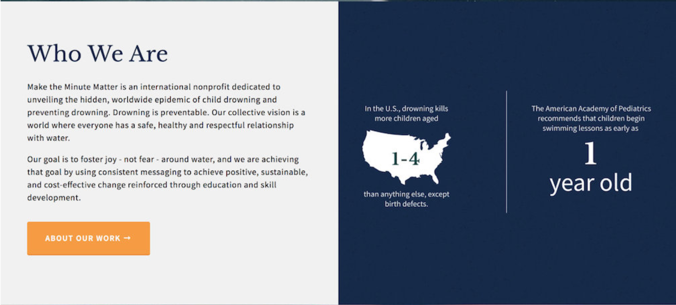
A couple of years ago, we worked with our client the Chill Foundation to create some vibrant outcomes-focused infographics to illustrate their successful work with at-risk youth. More recently, we collaborated with our client, drowning awareness campaign Make the Minute Matter, to create a series of infographics that presented the problem and corresponding solutions to this epidemic.
And, both have an added bonus—these are shareable and Pin-able, so it’s easy for supporters to spread the word about your good work.
This may be easier for some organizations than others in terms of positioning, but it’s possible no matter what your focus is. Think about the imagery you choose, how you craft your text (present a corresponding solution when discussing a problem), and how you can make website visitors excited to join your team and solve problems together.
#2 Use a lead magnet to nurture engagement and raise awareness
What’s a lead magnet, you might ask? There are a lot of terms that are basically the same thing that get tossed about in the online entrepreneur world: “content upgrade,” “signup incentive,” “freemium offers.” Whatever you call it, the crux of a lead magnet is to inspire people to sign up for your mailing list in exchange for some sort of offer. Then, since you’ve got them on your mailing list, you can educate them and nurture the relationship.
Mailing lists can be hard for people to get their heads around because there’s rarely a straight shot that looks like: lead magnet > signup > offer > sale/donation/volunteer/etc. People can stay on your list, quietly opening and reading your updates for years before they take action.
Organizations can struggle with justifying putting the work into creating a killer lead magnet and sending out quality, meaty communication that will engage readers on a regular basis, not to mention creating introductory sequences and other automations within your email marketing system (we use and recommend ConvertKit for this, since the visual automations are so great, the emails are formatted like they’re coming from real humans and don’t feel salesy, and the tagging makes life so much easier).
And I get that, I really do. It’s something I have to force myself to carve out time for, since there’s always “more important” work to be done, but it does pay for itself in the long run, and that’s what we’re thinking about with list-building, growing long term support and engagement.
This article on the Freelancers Union blog is an incredible illustration of the value of list building for the long-haul—the author was offered a speaking gig after someone had read their newsletter for five years!
Once someone’s been enticed to join your list, you can begin gently educating them, sharing your success stories (which you’ve been collecting in step #1, I hope) and nurturing their relationship. Craft those messages so they feel like they’re personalized (again, tagging in ConvertKit makes this a lot easier, as you can start to “learn” their interests—read this piece about email segmentation to learn more) and make them friendly, like they’re coming from an real human. Don’t get too focused on design and making the message fancy, instead make it meaningful and relevant.
Don’t think you can do this? Here are some ideas for creating a nonprofit lead magnet.
A library foundation could create a shopping list for their book sale organized according to the sale layout. Is your nonprofit’s focus on a subject that’s often overwhelming or hard to understand? Make it engaging with an Interact quiz and educate people along the way like we did for Make the Minute Matter!
A membership organization could offer a substantive article or an ebook digging into a topic relevant to their audience. A trade association could offer editable social media graphics. Worry that people could use them without being formally associated with you? That’s fine! You’re focused on building awareness and nurturing those “leads.”
Don’t have a designer on your team to create your lead magnets? Well, let me introduce you to Creative Market! Loads of designers offer up affordable pre-designed lead magnet downloads that you can use and adapt. Some are even available on Canva, a web-based, free alternative to Photoshop. It’s not cheating—it’s working smartly.
#3 Invest in branding
Nimble startups and successful entrepreneurs understand their brand and their message and use it consistently. There are a whole lot of reasons this is one of the first things they tackle, namely that it plays a big role in helping present a professional, reliable image. People will immediately be able to understand what you’re all about and get a sense of the type of organization you are.
The reality is that most small nonprofits don’t feel great about dedicating precious donor dollars to branding. A fancy logo and colors and type treatment may seem frivolous in comparison to your important work. However, if your goal is to grow your audience, you need to look like you’re positioned to succeed. A polished, clear brand helps you do that. This sets the tone for everything you do. I often advise potential nonprofit clients to scale back their websites in order to budget for improving their brand so they can meet their organization goals.
It’s truly critical.
I’m not saying break the bank. What I am saying that nearly every single time I’ve worked with a DIYed or (non-professional) volunteer or staff-created logo, color palette and type treatment, the organization has ended up deciding to invest in improved branding once they’ve seen their unrefined brand on a sparkly new website.
While investing in a comprehensive brand strategy can be quite costly (and a lot of work on your part), there are accessible options out there if you’re trying to balance your marketing priorities. (Our team is always happy to connect folks to great solutions to help you put your best foot forward.)
When we worked with PAW Team, we were originally working with their old crimson and black logo, but that required a very specific color palette that simply didn’t convey the hopeful, compassionate tone they wanted to set with their new website. Furthermore, there are many, many animal-related charities in the Portland-metro area, and some are exceedingly well-funded in terms of marketing, so the standards are high.
Sometimes, the reality is that it’s essential to keep pace with your “competition.”
I tell our nonprofit clients the same thing as our entrepreneur clients with regard to branding: Don’t play it too safely. You want to be memorable.
Look outside your niche for inspiration, don’t be afraid to zig where others zag with colors and typography and embrace an interesting font or two.
Is your brand authentic, meaningful, and distinctive? If not, give it a rethink before you dig into a website project.
Key Takeaways
Position your organization as a solution. It's fine to document the problem (it's actually preferred) but don't stop there. Use stories, infographics, and compelling visuals to show how your organization provides a critical solution.
Use a lead magnet to nurture engagement and raise awareness. This step builds your email list and helps you bring new potential donors and volunteers into the organization. Not sure what a lead magnet is? Here's a great example of our nonprofit donation page guide lead magnet.
Invest in branding. Remember, branding encompasses more than just a logo. It's your logo, messaging, aesthetic, and the way you present your organization.


Confused by the variety of responses you’ve received to your WordPress or Squarespace website design RFP? Here are five questions to make sure you know the answers to before moving forward. Click here to read the article!